
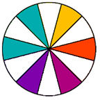
We will be starting with a basic color wheel, along with some of the terms you should know. A must have for any artist who is working with colors is a color wheel which shows the relationship of colors to each other.
Here is a basic color wheel now lets break it down so you can understand it better

There are three primary colors (red, blue, yellow)


The tertiary colors are created when a primary color is mixed with one of the secondary color such as red-orange, yellow-green and blue-violet.
When you mix a color with gray, you create "tones" of the color.

When you mix a color with black, you create "shades" of the color.

When you mix a color with white, you create "tints" of the color.

The color value is determined by the lightness or darkness of a single chosen color.
Now for color combinations
There are several combinations of these colors that are pleasing to the eye when used.
Complementary colors would be your main color and the color that is directly opposite it on the wheel. This tends to give a very bold, dramatic effect.

Split Complementary colors are the two colors on either side of the complement color plus your main color. This can add a bit of sophistication.

Triad colors would be every fourth color on the wheel, thus forming a triangle. A primary triad is bright and youthful, secondary colors are more subtle, and triads made up of the tertiary colors are sophisticated and fashion-oriented.

Analogous colors are three to five colors which are next to each other on the wheel. This would be your main color, along with either one or two colors on either side of it. You can really make it pop by putting in a touch of the complementary color as well.


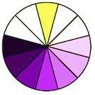
Monochromatic would be different values (light & dark) of your key color. Using different tones, tints and shades of your key color is pleasing to the eye and creates unity. Again, a little bit of the complementary color can really enhance a monochromatic color scheme.

To start your color scheme, choose your "Main" color. This main color will be present in about 70% of your creation, 20% of a secondary color will be present in your creation, and last your accent color which will be present in about 10% of your creation.
If you are creating for use with a special photo pull your main color right from your photograph and apply the above color rules. Have fun and play with your color choices till you hit that magic combination that really makes you say wow
Here is a list of some of my favorite online color scheme generators.
http://colorschemedesigner.com/
http://www.colorsontheweb.com/colorwizard.asp


No comments:
Post a Comment