Saturday, January 29, 2011

Valentines Day Alphas

While playing with the glass effect tut I created an orb that I thought would work great for Valentines Day so I turned it into these Alpha sets
Enjoy :)


Downloads

Scrapbooking Sets
 The rings for alphas Here       Red Set     Violet Set     White Set

Tagger Sets
The rings for alphas Here      Red Set    Violet Set      White Set

Friday, January 28, 2011

Creating the glass effect

In this tutorial I will show you how to create a glass orb and other glass shapes that can be placed over your favorite alpha or to create a new alpha as well as placing them over other images that will give you that glass stone effect and another way to use your favorite scrapping supplies.


First we will need to create a new image to do this

Go to file and select new the new image box will open and you will need to place the following information.

For a full size Scrapbooking Element you will use {Width 200…Height 200… Units Pixels … Resolution 100} in the image Characteristics section have the Raster Background selected as well as the Transparent selection checked.

For a Tagger Size Element you will use {Width 600…Height 600… Units Pixels … Resolution 300} in the image Characteristics section have the Raster Background selected as well as the Transparent selection checked.

Now that you have your blank working area we can create the glass orb.

1. Go to Effects and select Artistic Effects now select balls and bubbles


2.    Under the 1st tab Shapes you should have single ball or bubble selected.


3.    Under the second tab Surface  the materials should be white… Opacity 15… Shininess 50… and Gloss 76.


4.    Under Illumination Ambience Maximum 19 … Minimum 0…  Lights-light 1…  Color should be white.. Highlight size 25… No Type should be checked . When all the tabs have been finished click on ok. You see we have not used the maps tab at all there will be more about this tab at the end of this tutorial .


You will have something that looks like this(I filled in an under raster layer so that you could see it better)


Now that we have created this cute little bubble we want to flatten it out to get that nice flat glass stone look to do this we need to warp the image we just created.


1. Go to Effects… Distortion Effects and then click on Warp.

2. We will only change the settings here to Size 50…. And Strength 90 then click ok

You will have something that looks like this


Giving your glass demention
1.    Choose the Magic Wand Tool and set the Match Mode to All Opaque. You can now click on any part of the stone and it will all become Masked.


2.    Now that you have the whole stone masked you want to Invert the masked selection . To do this Go to Selections tab and choose invert.


3. Go to Apply Effects… 3D Effects…and click on Drop Shadow.


4. Settings for the drop Shadow box are offset: Vertical 8… Horizontal 8… Attributes: Opacity 75… Blur 40…and the color black then click ok when finished.


5. Go to The Selections tab again and select none and the masked area will disappear.


You have completed this tutorial and should have a finished glass stone that looks something like this.

 
To save your stone Go to File… Export…and click on PNG Optimizer


Now to have fun and play with what we just learned


The easiest thing to change and play with is to colorize your stone simply go to

1. Adjust… Hue and Saturation…then Colorize


To Have fun creating new stone shapes, Simply go to Effects.. Distortion Effects there are many different options there so let your self go crazy!!! And do not limit yourself to only using one distortion on it use multiple effects to create a new and exciting shape.


Here are a few examples:


To change the shape you can also use the Mesh warp tool


Not only can you change the shape and the color. You can change step 2 so you can add texture to your glass.


1. Go to Effects and select Artistic Effects now select balls and bubbles

2. Click on the maps Tab.

3. If you check the bump map box and choose an image it will add that texture to your glass play with the settings till you create the effect you want.


I hope you had fun with this tutorial and would love to see your results !!!!


Friday, January 7, 2011

How to Choose a Color Scheme

We are going to start this year out by first learning the basics about colors themself. The color scheme you choose will set the whole mood that your kit will create in the people who choose to use it, Certain colors may arouse certain memories and feelings in people and u will want to be able to tap into this. By understanding how colors work together you will end up with a successful color scheme and a beautiful kit as well.

We will be starting with a basic color wheel, along with some of the terms you should know. A must have for any artist who is working with colors is a color wheel which shows the relationship of colors to each other.

Here is a basic color wheel now lets break it down so you can understand it better


There are three primary colors (red, blue, yellow)


There are three secondary colors these colors are the result of mixing 2 of the primary colors together (purple, orange, green)


The tertiary colors are created when a primary color is mixed with one of the secondary color such as red-orange, yellow-green and blue-violet.


When you mix a color with gray, you create "tones" of the color.


When you mix a color with black, you create "shades" of the color.


When you mix a color with white, you create "tints" of the color.


The color value is determined by the lightness or darkness of a single chosen color.


Now for color combinations


There are several combinations of these colors that are pleasing to the eye when used.

Complementary colors would be your main color and the color that is directly opposite it on the wheel. This tends to give a very bold, dramatic effect.


Split Complementary colors are the two colors on either side of the complement color plus your main color. This can add a bit of sophistication.


Triad colors would be every fourth color on the wheel, thus forming a triangle. A primary triad is bright and youthful, secondary colors are more subtle, and triads made up of the tertiary colors are sophisticated and fashion-oriented.


Analogous colors are three to five colors which are next to each other on the wheel. This would be your main color, along with either one or two colors on either side of it. You can really make it pop by putting in a touch of the complementary color as well.


Monochromatic would be different values (light & dark) of your key color. Using different tones, tints and shades of your key color is pleasing to the eye and creates unity. Again, a little bit of the complementary color can really enhance a monochromatic color scheme.


To start your color scheme, choose your "Main" color. This main color will be present in about 70% of your creation, 20% of a secondary color will be present in your creation, and last your accent color which will be present in about 10% of your creation.

If you are creating for use with a special photo pull your main color right from your photograph and apply the above color rules. Have fun and play with your color choices till you hit that magic combination that really makes you say wow 

Here is a list of some of my favorite online color scheme generators.

http://colorschemedesigner.com/

http://www.colorsontheweb.com/colorwizard.asp


Saturday, December 18, 2010

Blog Visitors

This year I have had 6905 visitors to my blog from 74 different countries I hope you all are enjoying the new look and got everything you needed before I cleared it all out for the new Tutorials starting in January.
Wishing you all a great Holiday Season.. Keep on Scrapping and Crafting :)

Saturday, November 6, 2010

Ready for a new look and fresh creations :)

Will be revamping my blog during Nov. I have deleted all old links and scrapbooking links.... Will be writting some new tutorials so if there is something that you would like to know how to do leave me a message and I will add it to my list for next year. I should be completely done by January 1st 2011.. Happy scrapping till then.... :)

Saturday, April 11, 2009

Creating Papers 1 EZ Stripes and Patterns


Creating Papers Tutorials


Creating coordinating striped papers to go with your layouts

1. Choose The photo that you want to use.


I will be using this picture as an example. Aww arnt they cute hehehehe


2. Duplicate the photo and close the original.


3. Use the rectangle selection tool to select a portion of the image to get the colors you want to use.
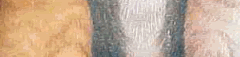

My Selection


4.Choose Effects Image Effects Offset.


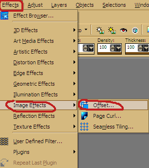
And use the following settings play with the horizontal offset settings till you get something you like


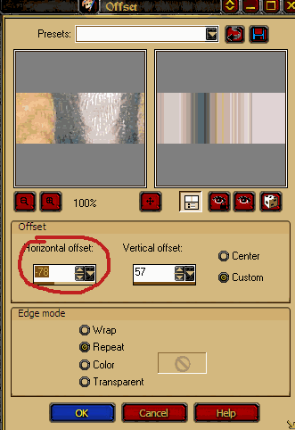
Here is what I ended up with


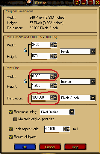
5.Ok time to resize and get proper dpi

Goto: Image / Resize


Set Width to the size of your paper if you don’t want the pattern to re-pete.

This is how mine is set.


If you want it to be a repeating pattern it would be set to less than the size of the paper.


Set The Resolution to 300 dpi


6. Now save Goto; File / Export / Jpg Optimizer and save


When you want to use simply open a new image and use this image as a fill and you have a great striped paper.

And this save massively on storage space.


Part 2 Endless papers to make from these simple stripes


Start with Opening one of your stripe Pattern Fills

I will be using the one I made in Part 1 Of this tutorial.


A. Simple way to get that Corrugated Paper look

1.Create a new Layer


2.Set To Gradient in the Materials Pallet On the foreground color


3. set the Background color to Black


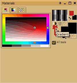
4. Fill new layer with the black Gradient

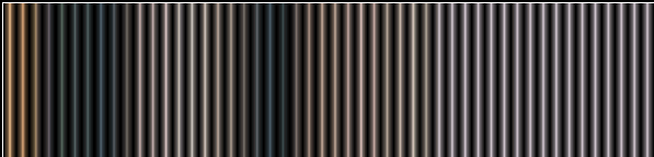
You will end up with something like this. It gives a metallic tube look to it


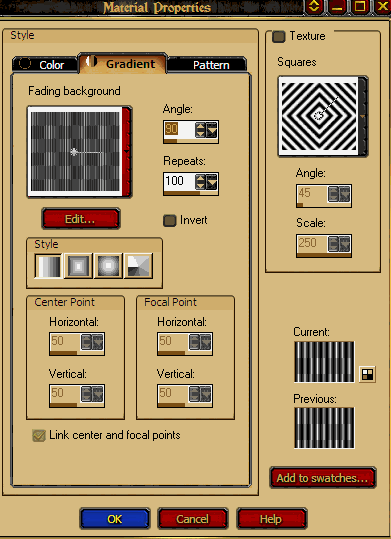
Settings I used for the fill play with these to get what you like.


5. Adjust the Opacity to your liking and there ya have it a corrugated looking paper fill


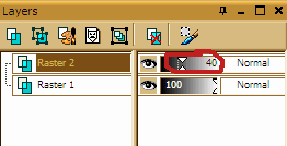
You can use this Technique over any finished paper to get this look.


B. Pattern Play

Again I will be using the Pattern Fill I made in Part 1 Of this tutorial.


Only one step here to make a million papers


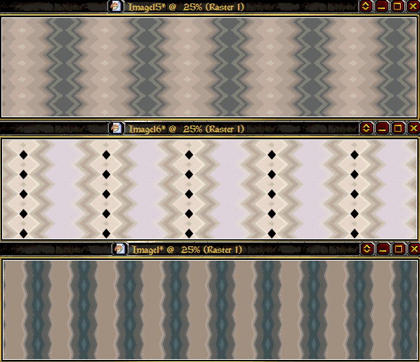
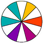
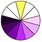
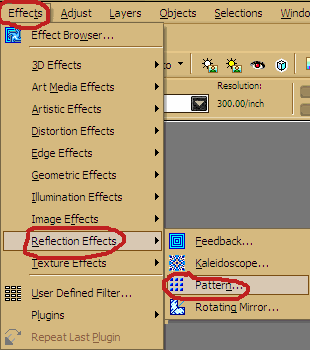
1 Goto : Effects / Reflection Effects / Pattern

Now just play with the settings and your done.


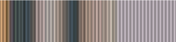
Here are a few Samples of how mine turned out.

I hope you have a ton of fun playing with this J


Thursday, January 15, 2009

Lets Make A Bottlecap


Bottlecap Tutorial
IBAScrappin1 AKA Cheryl
2 Cut down on the length of this tutorial I have supplied some templates.
Get Them Here
While doing this tutorial it is a good idea to save your settings in the different effects, so when you goto make another one they are already there for you
If you need some ideas for caps check out this site http://www.bottlecaporama.com/
For some reason i cant get the one section of the tut to line up right so I hope that you can still follow it .


1 Use your magic wand to mask the template image(keep masked till told to unmask)
2.Goto Effects/3d Effects /Inner Bevel use these settings


3. Goto Effects/Artistic Effects / Chrome and use these settings.


4.Goto Effects/ Geometric Effects/ Spherize and use these settings.


5.Goto Effects/3d Effects /Inner Bevel use these settings.
You can now unmask


Making The top of the cap
1 Create a new layer.
2. Using the paintbrush round shape, size 258 for tagger size cap, size 390 for scrap booking size
Paint your top color in the center of your cap base it should look something like this


3. Use your magic wand on what you just painted (keep masked till told to unmask)
4. Goto Effects > Artistic Effects > colored edges and use these settings: the color you choose should be a lighter shade of the color you are using.


5. Goto Effects > 3D effects > Inner bevel and use these settings: For the color in this 1 go a little darker. Just play with it till u get the result you want. U will see the fifference in the right side of the box


You should have something like this but in your color


6 Use the Raster Deform tool to size your cap top so that it is how u want it. Unmask when finished.
In this sample I have made it a little longer to cover the white spot on the top and bottom


7. Now just decorate your cap to your liking.


Note : if you want color the bottom part simply use the dropper and get the color off the top and use the change to target brush tool on the bottom of your cap Then goto adjust /brightness darkness to get the look you want. And change to target brush tool 1 more time . And it will look something like this.


And after playing with it for a bit this is what I ended up with


Hope you enjoyed this tut and that it was helpful. Would love to see your creations from it so drop me a comment so I can see where u have it posted

World Scrappers

Tunes


MusicPlaylistView Profile
Create a playlist at MixPod.com